
Front
Front
Front
The front was made to immediately show one of t
he key core values DaDean's was about, being flippant and unserious.
Back
Front
Front

While some would suggest "business in the front, party in the back", I opted for the opposite, with the "party" being shown in the front, while the primary key information is on the back, with the restaurants' address and other contact information.
Billboard and Slogan
Every business needs advertisement and one method that a smaller, more local restaurant like DaDeans would likely use would be billboards. Here was where I developed the slogan that kept the through line of adding "Da-" as a prefix. The owner was adamant I keep this up to really drive home the flippant tone. The idea was that this was a local restaurant that locals would already know the location of, and just needed to be reminded of every now and then.

Front of Menu

Back of Menu

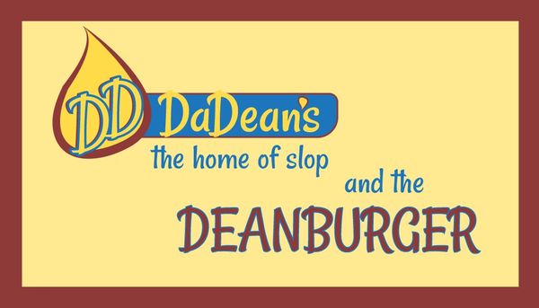
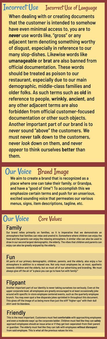
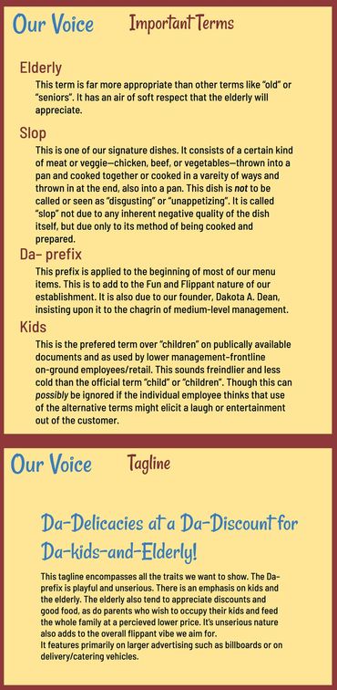
This is the beginning of the style guide. Pretty much since the beginning, I knew I wanted to do a family-oriented, burger-and-grill joint catered mainly to the 2 opposite ends of the age spectrum, the elderly and children. Not to say that the elderly are like children, but rather that families and more well-off older people would be the primary focus of the marketing. So I wanted to alway keep a lighter, more playful feel. I was mainly inspired by the older franchise restaurant logos, you know the ones; McDonalds, Burger King, Culvers, White Castle, Hardy’s, along with thousands of other grill-based restaurants. I wasn’t taking after their modern branding, but rather took notes from some of these restaurants’ older branding. I did it intentionally, so as to grab the attention of the elderly who might just recognize the motifs and stylings. For the logo I knew I wanted it to be something that naturally flowed off the tongue and somehow incorporate my name somewhere, and “Dakota” doesn’t flow as well as “Dean”, but almost instantly when I started the project I had the idea to combine these 2 into a quick and catchy 2-syllable “phrase”. So my naming choice was pretty much decided for me the moment I started, with the name “DaDean’s”. The “‘s” is because I noticed a trend in restaurant names to be in a possessive form. The shape that frames the Wordmark in the primary logo is supposed to be reminiscent of a signboard.
The flame was the first thing that came to mind when I figured out my demographic and theming. It’s supposed to be the small flame of a longneck lighter about to light up the grill—as well as the shape framing the Wordmark also being like the base of a torch as a way for it to work both ways and with the framed Wordmark. The 2 D’s inside are actually what helped me figure out the shape of the flame and after that it all pieced together nicely. The primary logo was made to fit more centrally on objects or surfaces and so was more square in how it took up space, the secondary logo needed to be a little of the opposite. So I made it more horizontal and leaned into the signboard look more. The secondary logo is meant to go in the corner of a space, or be fitted where the primary logo cannot.

The colors I chose all had the purpose of attracting the two primary demographic groups, the elderly and families—primarily their children. I was careful to always make the colors either deep or with more medial saturation, sometimes both. I wanted to steer clear of bright, flashy, saturated colors, both to appeal to the elderly and to be better for children’s eyes than the overexposure to bright colors they’re used to. This is with the exception of small uses of “Flame Red” for bringing attention to particular objects on the childrens’ menu, but its use is sparse. The names of the colors was also a purposeful choice to inject a more playful vibe into it.

What Not To Do

Typography

The Font I wanted to use came to me simultaneously easy and with a bit of difficulty. The Body and Copy Font just needed to be a readable, rounded sans serif that could fit with a variety of other fonts. The Display font—on the other hand—didn't come to me as quickly and naturally as the other parts of the branding. It all started from the word mark that took ages to finally nail down. I knew the font I used for the word mark would be what I used for the primary display font of the whole identity system. So the longer that t
ook, the longer it took to settle on a primary display font. Eventually I settle on Rancho Regular, as it had an old-timey and a slightly silly feeling simultaneously.
It was very clear to me when I made the logo and picked out the colors that the combination I had really only worked best in the original way I had composed it. Most other colorations and combinations I tried using these colors—or similar—always resulted in the colors losing their contrast, being almost invisible, or otherwise looking uncoordinated. So that was the first thing I specified not to do, as the colors were what really brought it all together. So if the colors were screwed up, then the rest of the branding would be too.
The organization of the 2 logos was also important for the general feeling of the branding. The primary logo needed to look like both the base of a low-lying torch and a signboard. This would be lost if the flame was too far away or too close to the word mark frame.
The secondary logo had to look more like a signboard than the primary one, but the space of the flame to the word mark was still just as important. Any other distance I tried other than what I ended up going with always looked off, so that was also important to get across in this "Incorrect Use" section.
This goes back to how each of the logos were made to be used. They were not made to be used in the ways the example's show, and so they should not be. Another little jab/joke is here in the quote "This is what people who don't think do," and again was inserted to lighten the tone and engage back with whomever's taking the time to properly engage with it.
